I remember standing in the middle of a hardware store aisle three years ago, staring at a wall of five hundred nearly identical beige paint swatches, feeling like I was losing my mind. I had just moved into my first solo apartment and wanted it to feel like a home, not a dorm room, but the sheer volume of “expert” advice made me feel like I needed a degree in fine arts just to pick a living room tint. Most people will tell you that you need to study color theory or hire a professional to figure out how to choose a color scheme that doesn’t look like a disaster, but honestly? That’s just gatekeeping.
I’m not here to sell you on expensive designer consultations or tell you that your taste is wrong. I want to show you how to use what you already have—your furniture, your lighting, and even that one thrifted chair you love—to build a cohesive look without breaking your budget. I’m going to break down the actual mechanics of how to choose a color scheme using a few practical, repeatable steps that work in the real world. Let’s stop overthinking the swatches and just get your space looking right.
Table of Contents
Mastering Color Theory for Beginners Without the Fluff
Look, you don’t need an art degree to understand color theory for beginners; you just need to understand how colors play together. Think of it like a budget—if you spend all your “visual energy” on one loud, neon accent, you won’t have anything left for the rest of the room. Most people get stuck trying to find the “perfect” shade, but it’s actually easier to think in terms of warm vs cool color tones. Warm tones (reds, oranges, yellows) make a space feel cozy and energetic, while cool tones (blues, greens, purples) are better for chilling out.
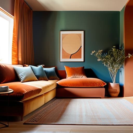
If you want a foolproof way to build an actual sense of interior design color harmony, use the 60-30-10 rule. I use this constantly when I’m restoring old sideboards. Aim for 60% of a dominant color (usually a neutral), 30% of a secondary color, and 10% for a bold accent. This prevents that overwhelming feeling where a room looks like a box of spilled crayons. It’s all about balance, not perfection.
Finding Your Rhythm With Interior Design Color Harmony
Once you’ve got the basics down, you need to figure out how those colors actually talk to each other. This is where interior design color harmony comes into play. It’s not about finding a “perfect” match; it’s about deciding what kind of energy you want the room to hold. If you want a space that feels like a deep exhale after a long shift, you’ll want to lean into warm vs cool color tones to set that mood. A cool, blue-toned bedroom might help you wind down, while a warm, earthy living room feels a lot more social and inviting.
Don’t feel like you have to pick a side and stay there forever, either. A lot of people get stuck trying to make everything match perfectly, but that’s how you end up with a room that feels sterile, like a hotel lobby. Instead, try playing with complementary color combinations to add a bit of life. If your base is mostly neutral, a single pop of a contrasting color—like a deep ochre pillow on a navy sofa—can make the whole setup feel intentional rather than accidental. Just keep it balanced.
5 Ways to Nail Your Palette Without Losing Your Mind
- Start with your “anchor” piece. Whether it’s that thrifted velvet armchair you just restored or a rug that actually has some soul, pick one item you love and build the rest of the room around its colors. It’s much easier to match a wall to a chair than it is to try and force a chair to fit a room that’s already decided.
- Use the 60-30-10 rule to keep things balanced. It sounds technical, but it’s just a simple way to avoid a room looking chaotic. Aim for 60% of a dominant color (usually your walls), 30% of a secondary color (furniture or curtains), and 10% for an accent color (pillows or art). It keeps the eye moving without feeling overwhelmed.
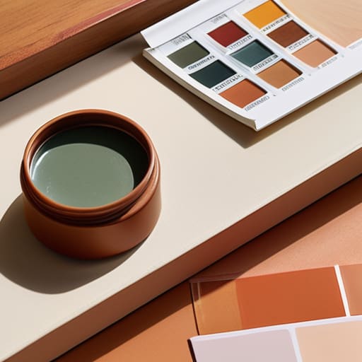
- Test your samples in real light, not just under the store’s fluorescent bulbs. I’ve seen so many people buy a “perfect” grey only to realize it looks like a gloomy basement once the sun hits it at 4 PM. Tape your swatches to the wall and check them in the morning, afternoon, and evening before you commit.
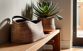
- Don’t fear the neutrals. You don’t need a rainbow in every corner to make a space feel “designed.” Using different textures—like a linen cushion against a wooden table—can add way more depth than adding a fifth bright color ever could. Neutrals are your best friend when you want a space that feels calm, not loud.
- Keep your “why” in mind. Before you buy a single can of paint, ask yourself how you want the room to feel. If it’s a bedroom, you probably want something that helps you decompress, not a high-energy neon. If it’s an office, you might want something that keeps you focused. Design for the mood, not just the aesthetic.
The Bottom Line: Keep It Simple
Don’t get stuck in “analysis paralysis” with a hundred different shades; pick one base tone you actually like and build the rest of your room around it.
Use the 60-30-10 rule to keep things balanced—it’s the easiest way to make a room look intentional without needing a degree in design.
Remember that your home is for living, not just for looking at, so if a color makes you feel calm and at home, it’s the right choice, regardless of what the trends say.
## The Golden Rule of Color
“Stop trying to design a showroom and start designing a home. A color scheme isn’t about following every rule in a textbook; it’s about picking a few tones that make you feel steady when you walk through the door, and then having the guts to stick with them.”
Owen Silas Vance
Stop Overthinking and Start Painting
At the end of the day, choosing a color scheme isn’t about following some rigid, high-end design rulebook; it’s about applying the basics of color theory and harmony to make your space feel intentional. We’ve covered how to use color wheels to find balance, how to play with temperature to change the mood of a room, and how to pick a palette that actually flows from one space to the next. Remember, you don’t need to match everything perfectly to achieve a cohesive look. You just need a solid foundation and the confidence to know that your choices are based on a bit of logic rather than just a random guess. Keep your samples small, test them in your specific lighting, and don’t let the fear of a “wrong” choice keep you stuck in a beige limbo.
I know it feels high-stakes when you’re staring at a wall of paint swatches, but I promise you, your home is a living project, not a museum piece. If you pick a shade and realize three months later that it makes the room feel too heavy, you can change it. That’s the beauty of living on your own terms—you have the agency to iterate and improve. Competence comes from taking the first step and learning from the result. So, grab a few testers, get some paint on the wall, and just start doing it. You’ve got the tools, you’ve got the plan, and you’re more than capable of making this space yours.
Frequently Asked Questions
How do I pick colors that won't make my small apartment feel even smaller?
Look, I get it. When you’re living in a tight space, the wrong shade can make your walls feel like they’re closing in. My rule of thumb? Stick to a light, cohesive palette. Use whites, soft greys, or pale blues to bounce light around the room. If you want color, bring it in through textures or small accents—like a thrifted velvet pillow—rather than painting every wall. Keep the base neutral, and let the room breathe.
What do I do if I pick a color I love but it clashes with the furniture I already own?
Don’t panic—you haven’t ruined the room. This happens to the best of us. Instead of repainting, use the “bridge” method. Find a single item, like a throw pillow or a small piece of art, that contains both your new favorite color and the tone of your existing furniture. It creates a visual link that makes the clash look intentional. If that fails, lean into the contrast; sometimes a deliberate mismatch looks more curated than a perfect match.
How many different colors am I actually allowed to use before a room starts looking messy?
Look, there’s no magic number, but if you’re feeling overwhelmed, stick to the 60-30-10 rule. Use a dominant color for 60% of the space (walls/rugs), a secondary for 30% (upholstery), and a bold accent for the final 10% (pillows/decor). If you go beyond three main hues, you risk the room looking like a thrift store exploded. Keep it intentional, not accidental. Less is usually more when you’re trying to keep things calm.